Responsive WordPress Theme – Caliber

A theme with simple controls and limitless potential. Work fast and build an amazing website!   Find out more »

UpThemes – Beautiful WordPress Themes

Create a site your church, gallery, newspaper, blog, recipes, band and more!   See the themes »

Need a little help?  Find answers quickly by searching the forum.
Group Admins
  • andy
  • jeffw

Support for: Salutation: WordPress + BuddyPress Theme

Salutation (WordPress)

Public Group  |  active 4 years, 4 months ago ago
Viewing post 1 to 5 (5 total posts)

Default page size

  • mthant

    said

    What is the default page size for salutaion theme?
    Thanks,
    Myo

  • jeffw

    said

    I’m not sure what you mean. Can you explain in more detail?

  • mthant

    said

    I am trying (& learning) to modify the home page. I am trying to figure out exactly the default page width and height that comes with your sample header, content and footer. For example, if I use a layout 2/3 1/3 container, what will be the width of the 2/3 e.g. 600px?
    Myo

  • jeffw

    said

    All pages will be 926px wide, unless the browser width is less than 926px (on a small laptop perhaps, or on a tablet or phone) in which case the page width will change depending on what the browser width is. That’s because the theme is responsive, i.e. the size of elements and the design layout will respond to the browser width and adapt automatically.

    The height of any page is determined solely by whatever content is on the page.

    Columns widths are defined in percentages, there is no fixed width for them.

    Here are the definitions from the ‘style-default.css’ stylesheet…

    .col-1-2  { width: 48.5%; }  /* 1/2 width */
    .col-1-3  { width: 31.3%; }  /* 1/3 width */
    .col-2-3  { width: 65.6%; }  /* 2/3 width */
    .col-1-4  { width: 22.7%; }  /* 1/4 width */
    .col-3-4  { width: 74.2%; }  /* 3/4 width */
    .col-1-5  { width: 17.6%; }  /* 1/5 width */
    .col-2-5  { width: 38.2%; }  /* 2/5 width */
    .col-3-5  { width: 58.8%; }  /* 3/5 width */
    .col-4-5  { width: 79.4%; }  /* 4/5 width */

    There is 3% of white space between each column.

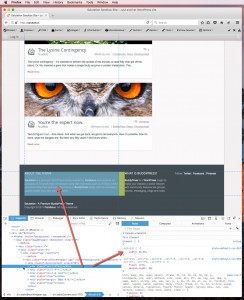
    If you use Internet Explorer, Chrome, Firefox, Safari or Opera you can use the browser’s built-in developer tools to point at and “inspect” elements on a web page to find out the dimensions of elements and what styles they use. For example…


  • mthant

    said

    Thank you very. It is very informative.

Viewing post 1 to 5 (5 total posts)
Topic tags: page, size, theme page