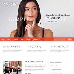
Buttons
This is the size and style of a default button. Below is the shortcode used to create this button.
[button onclick="alert('Clicked!');"]Default Button[/button]
[button_link url="http://mysite.com"]Default Button[/button_link]
This is an example of a Small button. Small buttons are just like normal buttons only smaller.
[button style="small" onclick="alert('Clicked!');"]Small Button[/button]
[button_link style="small" url="#"]Small Button[/button_link]
This is an example of a Large button. Again, just like normal buttons only this time, larger.
[button style="large" onclick="alert('Clicked!');"]Large Button[/button]
[button_link style="large" url="#"]Large Button[/button_link]
Impact buttons draw attention with large bold text to set them apart from other buttons.
[button style="impactBtn" onclick=""]Impact Button[/button]
[button_link style="impactBtn" url="#"]Impact Button[/button_link]
Custom Colors
Specify the button background and text colors using the background and color parameters.
[button color="#fff" background="#1693A5"]Click me[/button]
Buttons with Icons
Specify a theme icon to use on a button. Enter the name for your button icon using the icon parameter.
[button icon="icon-ok"]Icon Button[/button]
Standard Button
[button]Button Text[/button]Parameters (Standard Button)
- style
- (string) (Optional) The button size or for impact buttons.
- Values: small, medium (default), large, impactBtn
- color
- (string) (Optional) The text color for the button. Any CSS color value can be used.
- background
- (string) (Optional) The background color for the button. Any CSS color value can be used.
- icon
- (string) (Optional) The class name of an optional icon. Any icon class listed in the icon shortcodes can be used.
- title
- (string) (Optional) Title attribute.
- class
- (string) (Optional) Class attribute.
- id
- (string) (Optional) ID attribute.
- onclick
- (string) (Optional) JavaScript onclick functionality.
- name
- (string) (Optional) Forms object name attribute.
- value
- (string) (Optional) Forms object value attribute.
Link Button
[button_link url="http://www.mysite.com"]Button Text[/button_link]Parameters (Link Button)
- url
- (string) Link to follow when clicked.
- target
- (string) (Optional) Link target attribute: blank, parent, self, top.
- style
- (string) (Optional) The button size or for impact buttons.
- Values: small, medium (default), large, impactBtn
- color
- (string) (Optional) The text color for the button. Any CSS color value can be used.
- background
- (string) (Optional) The background color for the button. Any CSS color value can be used.
- icon
- (string) (Optional) The class name of an optional icon. Any icon class listed in the icon shortcodes can be used.
- title
- (string) (Optional) Title attribute.
- class
- (string) (Optional) Class attribute.
- id
- (string) (Optional) ID attribute.
- onclick
- (string) (Optional) JavaScript onclick functionality.