
We’ve added CSS classes to the Vellum stylesheets that can help you to create eye-catching and professionally designed content. We have made liberal use of these classes on the demo website, and you can use these “helper” CSS classes in your own HTML by adding them to an element, such as a div or p element for example; some can also be used by adding them to Visual Composer rows or columns as extra classes, or to any other element that can accept a CSS class in its settings. This article is a guide to some of these helper CSS classes, describing how and where to use them and providing examples of use and example output.
Should there be anything in this article that you don’t understand, please feel free to start a topic in the Vellum support forum and ask for clarification. Similarly, if you have any ideas for other helper CSS classes we could include with Vellum, we’d love to hear your ideas so please start a topic in the support forum and let us know.
Big headlines
For those times when an <H1> headline simply is not big enough, we’ve added a big-headline helper class. The font size is set to 65px and the big headline will use the same font as all other headings, and it will be the same colour as all other headings.

Classes available
.big-headline
Example use in HTML
<h1 class="big-headline">Works with H1-H6</h1>

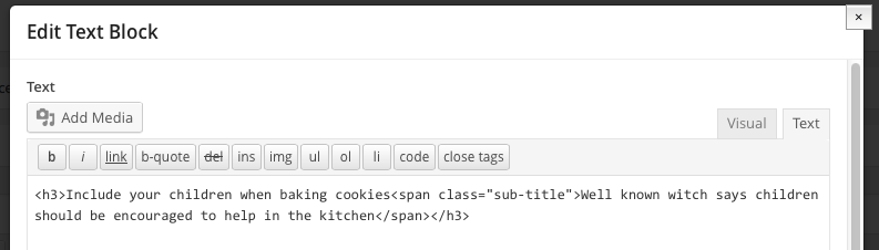
Sub-titles in headings
Sub-titles directly underneath headlines can be effective in helping the reader quickly assess whether they want to invest their time in reading the rest of the content on the page. In the print publishing trade this device is known as a ‘standfirst’ or a ‘kicker’ and the idea is to summarise the article in a short sentence or two. The font size of sub-titles will be 75% of the heading font-size, and its colour will be a middle shade of grey (#999999).
Classes available
.sub-title
Example use in HTML
<h3>Works with H1-H6<span class="sub-title">The sub-title</span></h3>
Accent text in headings
Sometimes the meaning of a phrase can change subtly when different words in that phrase are emphasised. To make sure readers emphasise the correct words when reading a heading, and so better understand exactly what you are trying to get across to them, you can wrap words in an <em> tag and those words in the heading will be picked out in whatever colour you have set for Accent Color in Appearance > Theme Options > Theme Options underneath the “Design Styles” heading.

Example use in HTML
<h2>Works with <em>all</em> heading tags (H1-H6)</h2>

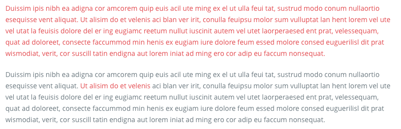
Accent text in paragraphs
Similar to emphasis words in headlines (see above) it can also aid comprehension of an article if emphasis is given to words, or phrases, or even whole paragraphs. It’s not something you should overdo because it can quickly become tiresome, making the text difficult to read, and it may have the exact opposite effect on your reader to that intended or even drive them away from the page.
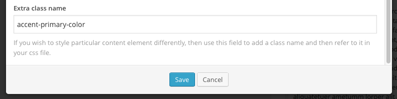
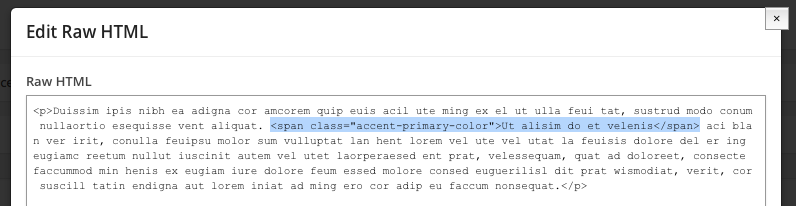
To set all the text in a Text Block to the currently set accent colour (Appearance > Theme Options > Theme Options) you can add the accent-primary-color class to the element’s Extra class name input box (see screenshot below). Alternatively you can pick out single words or phrases in your HTML by wrapping them in an span element that references the accent-primary-color class.
Classes available
.accent-primary-color
Example use in HTML
<p>Highlight any text in the <span class="accent-primary-color">accent</span> colour.</p>
Accent colour backgrounds
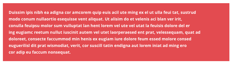
A great way to make some particular content stand out on a page is to put it inside a box that uses the accent colour as it background. It’s easiest to do this with some HTML, as shown below, as you will also need to add some padding around the block of text, and also set the text colour and weight. However you can also add the accent-primary class to any Visual Composer row, column or element that allows for an extra class name. Similarly, in your HTML you can add the class to any element to set the background colour for the element to the accent colour.
Classes available
.accent-primary
Example use in HTML
<div class="accent-primary" style="padding: 20px">
  <p style="color: white; font-weight: bold">
    Bold white text on accent colour background.
  </p>
</div>

<h1 class="accent-primary" style="color:white;padding:5px">The cat sat on the mat</h1>
<h1>Hickory, dickory, dock...<span class="sub-title accent-primary">The mouse ran up the clock</span></h1>

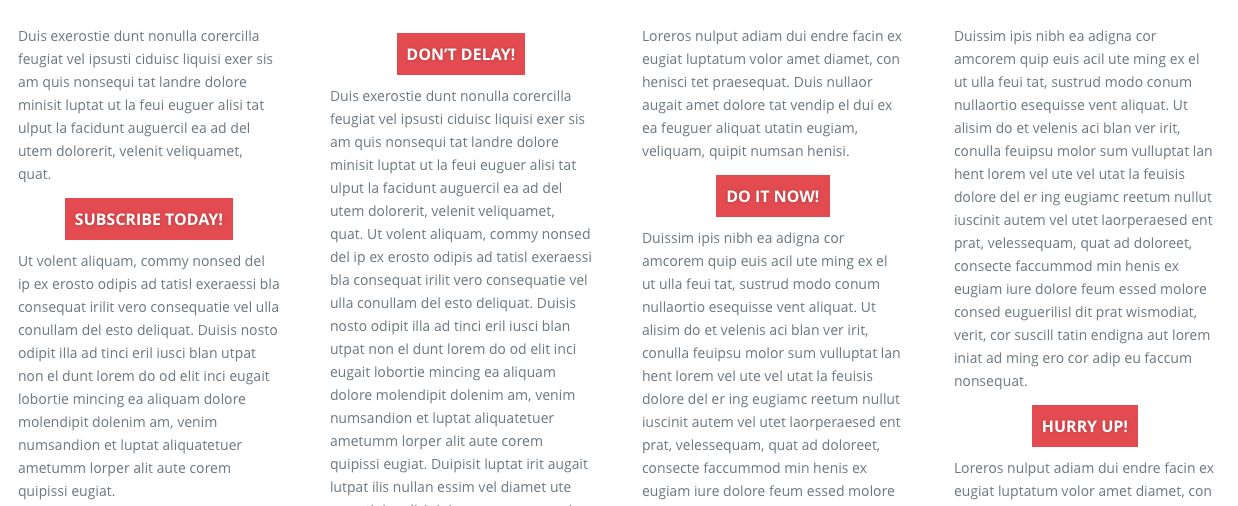
Accent colour buttons
Big buttons that are the accent colour are always going to attract the eye before anything else on the page. You can already do that with the Button element and that produces a button that goes a little darker when you hover over it. There’s another style in the theme that produces a button that gets a little lighter when you hover over it, and also adds a shadow to produce an old school 3D effect. You can’t add the impactBtn class to the Button element because that creates a styling conflict, so the way to use it is with some custom HTML as illustrated below.
Classes available
.impactBtn
Example use in HTML
<div style="text-align: center; margin: 20px">
  <a class="impactBtn" style="padding: 10px" href="#">SUBSCRIBE TODAY!</a>
</div>
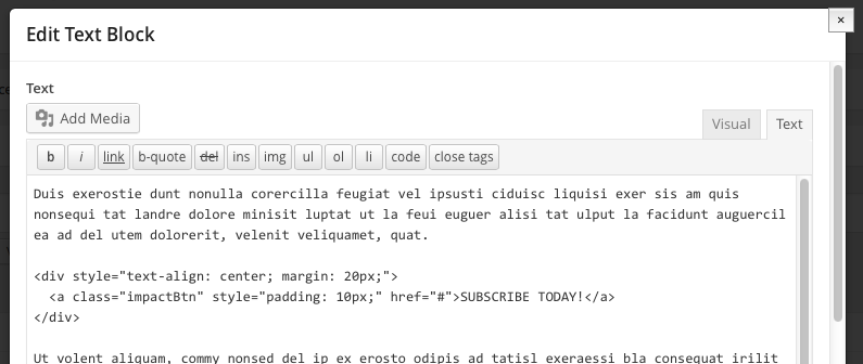
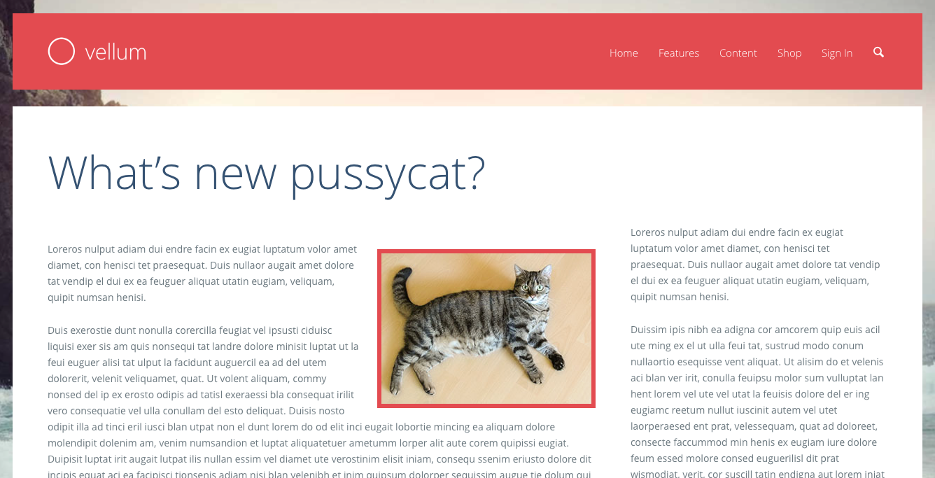
Image alignment and borders
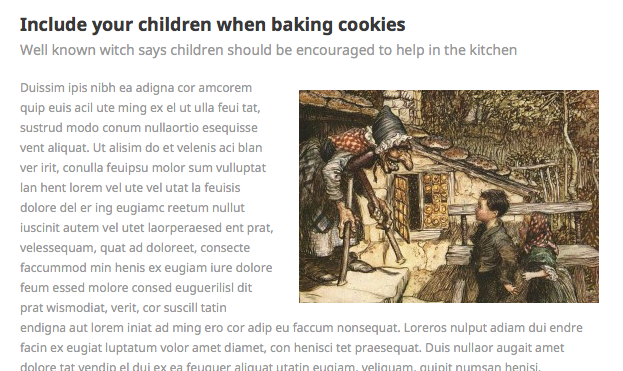
Web page design fashions change, but one thing that never seems to change is the desire of web page designers to have text running around images. And why not! So we’ve added three classes to the theme that enable you to quickly set image alignment. The alignleft and alignright classes float the images they are used with so that text can flow around them.
And while you are at it, if you want your image framed you can optionally add one of the five image border classes. If you add an image border class to a surrounding div element then all the images inside that div will have that border applied.
Classes available
.alignleft
.alignright
.aligncenter
.image-border-thin
.image-border-medium
.image-border-thick
.image-border-white
.image-border-black
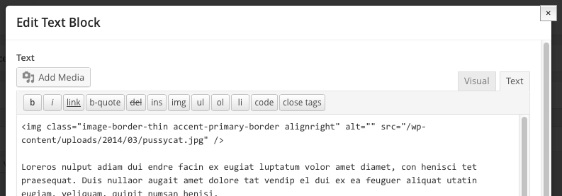
Example use in HTML
<img class="image-border-thin alignright" src="my-image.jpg" alt="" />
<p>Loreros nulput adiam dui endre facin ex eugiat luptatum volor amet diamet, con henisci tet praesequat. Duis nullaor augait amet dolore tat vendip el dui ex ea feuguer aliquat utatin eugiam, veliquam, quipit numsan henisi.</p>

<div class="image-border-thin">
  <img src="my-image1.jpg" alt="" />
  <img src="my-image2.jpg" alt="" />
  <img src="my-image3.jpg" alt="" />
</div>
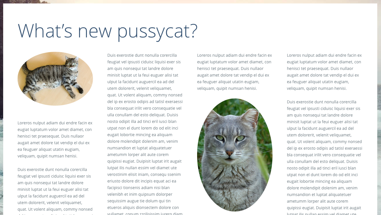
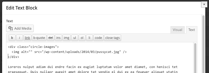
Circular and oval images
Here are a couple of classes that will turn square or rectangular images into circular or oval images. These classes will also work with the image alignment and border classes described above. Note that the image isn’t actually modified in any way, it’s achieved by setting the img element’s border radius to 50%. Simple, but effective.
Classes available
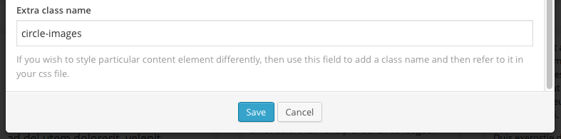
.circle-images
.circle-image
Example use in HTML
<img class="circle-image" src="my-image.jpg" alt="" />

<div class="circle-images">
  <img =src="my-image1.jpg" alt="" />
  <img =src="my-image2.jpg" alt="" />
  <img =src="my-image3.jpg" alt="" />
</div>
Responsive classes
These responsive helper classes enable you to display different content on different devices. You can use them in your HTML, or add them to anything that can accept a CSS class in its settings such as Visual Composer rows and columns for example. The classes work by using CSS @media queries to determine the current width of the browser window and hiding or displaying content according to which class encloses the content.
Classes available
.hidden-phone
.hidden-tablet
.hidden-desktop
.hidden-ipad
.visible-phone
.visible-tablet
.visible-desktop
.visible-ipad
.centered-phone
Example use in HTML
<div class="visible-desktop">
  <p>Visible on desktop displays but not on tablets and smartphones.</p>
</div>
<div class="hidden-desktop">
  <p>Visible on tablets and smartphones but not on desktop displays.</p>
</div>
<div class="visible-desktop visible-tablet">
  <p>Visible on desktop displays and tablets but not on smartphones.</p>
</div>
<div class="visible-phone">
  <p>Visible only on smartphones.</p>
</div>
<div class="centered-phone">
  <p>Visible only on smartphones and centred.</p>
</div>

<p class="visible-desktop">Visible only on desktop displays.</p>
<p class="visible-tablet">Visible only on tablets.</p>
<p class="visible-phone">Visible only on smartphones.</p>
Print classes
Similar to the responsive classes above, these print classes can be used to specify what does and does not get sent to the printer should a visitor to your website be so ecologically unsound as to want a hardcopy of the web page.
Classes available
.hidden-print
.visible-print
Example use in HTML
<div class="hidden-print">
  <p>
    The content inside this div element will be displayed on the screen but
    will not appear on the page when it is printed.
  </p>
</div>

<div class="visible-print">
  <p>
    The content inside this div element will not be displayed on the screen
    but it will appear on the page when it is printed.
  </p>
</div>
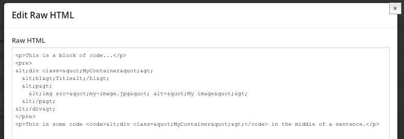
Formatted code
It is important to understand from the get-go that we are not here talking about something that can parse code automatically and output it with colour-coded keywords and all that. If that’s what you want then you’ll need a plugin. What we’ve done is added some styling to the HTML code and pre elements to set some padding, set a background colour and set a monospaced font.
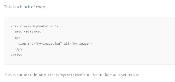
Example use in HTML
<p>This is a block of code...</p>
<pre>
<div class="MyContainer">
<h1>Title</h1>
<p>
<img src="my-image.jpg" alt="My image">
</p>
</div>
</pre>
<p>This is some code <code><div class="MyContainer"></code> in the middle of a sentence.</p>
Vertically centred content
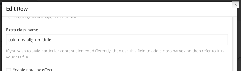
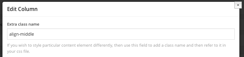
We've all been there, that awkward situation where you end up with tall content next to short content and it looks like the short content has had an argument with whatever is underneath it. So we have added a couple of styles you can add to the Extra class name input box in Visual Composer rows and columns. The class name you add to rows (columns-align-middle) will vertically centre the content of all columns in the row, using the tallest column in the row as the guide height. The class name you add to a column (align-middle) will vertically centre the content of that column only, again using the tallest column in the row as the guide height.
Classes available
.columns-align-middle
.align-middle
So there you have it, those are our CSS helper classes and we hope you find them useful. Don't forget, if you have any questions about these helper classes please just start a new topic in the Vellum support forum. Likewise if you have any ideas for other helper CSS classes we could include with Vellum. Good luck with your website! 
Resources
- Inspiration: Vellum demo site
- Support forum: http://para.llel.us/support/groups/vellum/forum/
